Coverage Checkup ad campaign for Ramsey Solutions
In the United States, insurance is:
A: important, and for some coverage types, mandatory
B: boring
C: confusing
D: frustrating
E: all of the above
Client: Ramsey Solutions
Discipline: Marketing Strategy
Designing for the mundane
When it came to designing a compelling and effective advertising campaign for Ramsey’s Coverage Checkup Tool, I began by talking with marketers and data analysts to better understand where potential customers where coming from and what their motivations were.
After that, I engaged in competitor research to see the environment that these ads would exist within. I knew we were creating ads for social media: specifically Meta (Facebook, Instagram), and Google.
I partnered with our copywriter to develop language based on the Coverage Checkup’s value proposition and how it could help our target demographic.
Brainstorming graphics
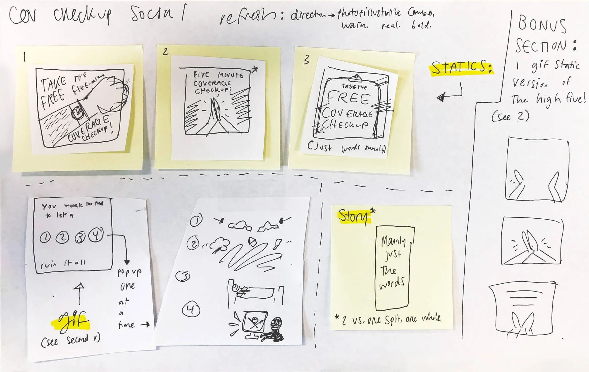
Sketching ideas:


Story ad:
This story-shaped ad ran as one of several versions of the ad. Some included animation and some were static. The story ads for this campaign were not as successful as our in-line ads for Meta. This could be because they tended to be more text-heavy and that could have overwhelmed some potential customers. The story ad displayed below was one of the higher performers out of the set for stories on Meta.
Square gif ad:
The final square gif-style ad ran on all Meta platforms and lowered cost-per-lead by 53%. This ad resonated with viewers, likely due to being simple, including motion, and showing successful and positive imagery.
Designing this ad campaign was a great learning moment for recognizing when simpler is better, and when animation and illustration can be very successful. They shouldn’t always be used, but they can be quite poignant when done right.


